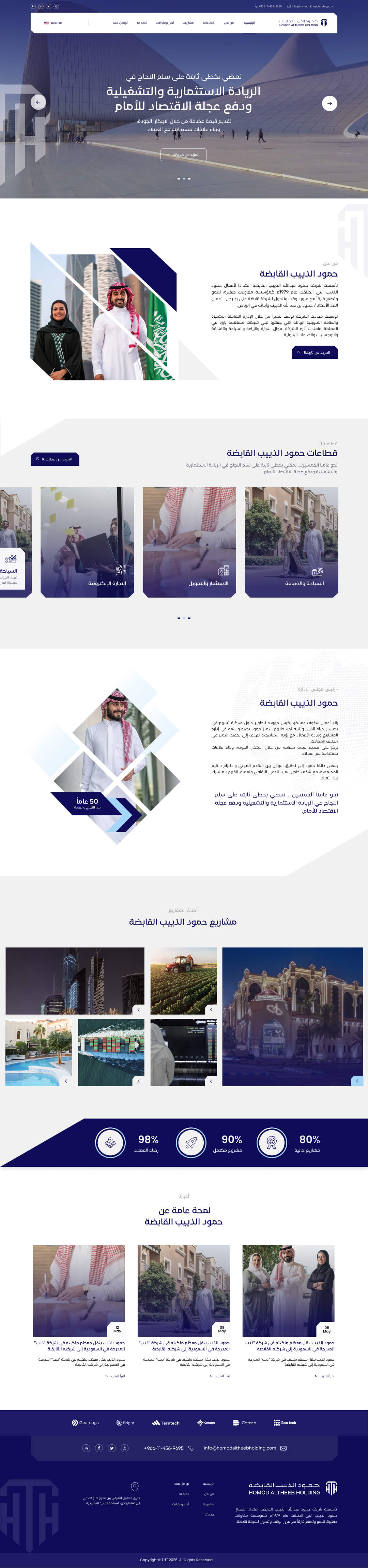
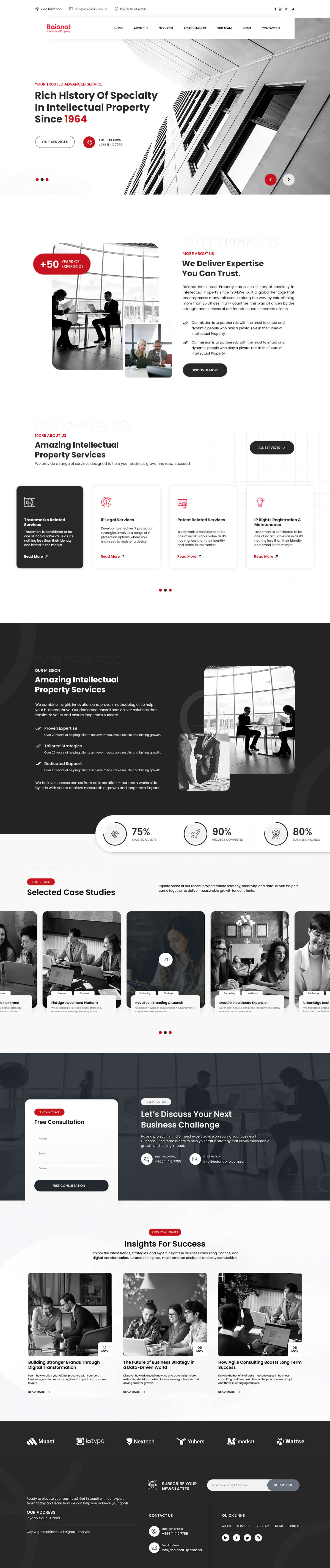
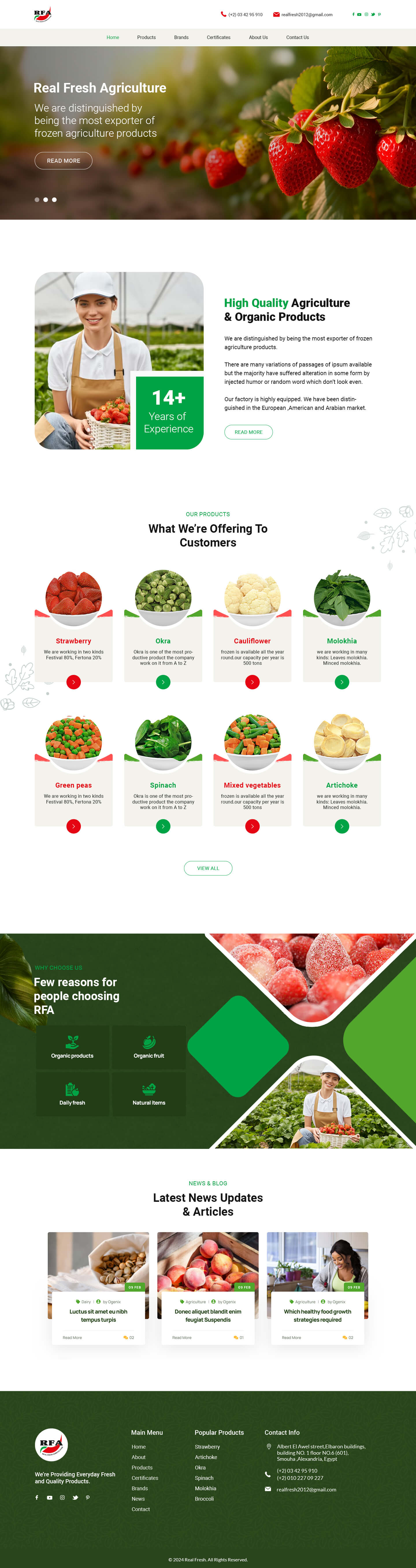
Pixel-accurate, fast-loading interfaces built with hand-written HTML, CSS and JavaScript — no bloated builders.
Get a QuoteFront-end development is where design becomes real. I turn Figma files, mockups, or a rough idea into a responsive interface that looks right on every screen, from a small phone to a wide desktop monitor.
Every layout is built with modern CSS (Flexbox and Grid), organized with SCSS so it stays maintainable, and written to load fast — no unnecessary frameworks unless the project actually needs them.
Mobile-first builds using Flexbox and CSS Grid that adapt cleanly to any screen size.
Clean, modular stylesheets instead of page-builder bloat, so your site stays fast and easy to update.
Menus, sliders, forms, and animations built with vanilla JavaScript for a smooth, native feel.
Every build is checked across major browsers and devices before it ships.
We start with a quick call to understand your goals, your audience, and what "done" looks like for your project.
You get a clear, written scope with deliverables, timeline, and price — no vague hourly guesswork.
I design and build in focused milestones, sharing progress so you're never waiting in the dark.
You test everything on real devices, and I fine-tune based on your feedback before anything goes live.
I handle the go-live, then stay available for the first weeks to catch anything that needs adjusting.
Yes, I regularly convert design files into pixel-accurate, responsive code.
Every layout is built mobile-first, then adapted up to tablet and desktop.
Yes, front-end builds can be delivered as a static template or wired directly into a WordPress theme.